Introduction
The TreeView is one of the most useful structures in web
development. In this first part of my article I want to introduce to
you a wonderful control that Microsoft released for the .NET
Framework. Here you have a control with a rich Object Model that
lets you program various aspects by simply defining the value of
some properties, or by declaring some elements.
Download and Install WebControls
Before reading this article it will be useful if you have
downloaded and installed Microsoft Internet Explorer WebControls
Version 1.0 of the ASP.NET Server Controls from http://msdn.microsoft.com/downloads/samples/internet/asp_dot_net_servercontrols/webcontrols/Default.asp?WROXEMPTOKEN=2440221ZO0np8M1JqrR62zGgTp.
From the dropdown list "WebControls
Version 1.0 Installation Options " choose "Automatic Install: WebControls Version 1.0 Client
DHTML Behaviors and Server Controls ".
Wait until the browser prompts you to save or execute the file
(iewebcontrols.msi), then save it on
your hard disk and execute it.
At the end of installation, you can see in the Programs menu,
which can be accessed from the Start button, the "Microsoft Internet Explorer WebControls "
entry. There you can find a shortcut to the IE WebControls MSDN
documentation and a readme file where you can read the step by step
installer operations.
The Simplest TreeView
The first sample of a TreeView is a very simple program, the
source code for it can be found in the FirstTree.aspx file in
the support material of this article. I won't describe everything,
but I will describe the lines that are directly concerned with the
TreeView control.
The first line is an @Import
directive for the WebControls. This explicitly imports a namespace
into the page, making all classes and interfaces of the imported
namespace available. (If you want to know more on the @Import directive point your browser to http://msdn.microsoft.com/library/en-us/cpgenref/html/cpconimport.asp?WROXEMPTOKEN=2440221ZO0np8M1JqrR62zGgTp.) <%@ import namespace="Microsoft.Web.UI.WebControls" %>
The second line is an @Register
directive that associates an alias with the namespace and class name
for concise notation. Including this directive in a page allows you
to layout a TreeView server control
using declarative TreeView syntax.
If you want to know more on the @Register directive point your browser to http://msdn.microsoft.com/library/en-us/cpgenref/html/cpconregister.asp?WROXEMPTOKEN=2440221ZO0np8M1JqrR62zGgTp. <%@ Register TagPrefix="myfirsttree"
Namespace="Microsoft.Web.UI.WebControls"
Assembly="Microsoft.Web.UI.WebControls, Version=1.0.2.226, Culture=neutral,
PublicKeyToken=31bf3856ad364e35" %>
Note that all WebControls elements must be authored inside a
Form element. The runat="server" attribute has also to be
specified for the Form to indicate that ASP.NET will process the
results of any user input. So the TreeView element is a child of the
Form and has the runat="server"
attribute too.
Note the use of the tag prefix myfirsttree; this will be used for all the
WebControls elements in the page since it has been predefined in the
@Register directive. <HTML>
<HEAD></HEAD>
<BODY>
<FORM runat="server">
<myfirsttree:treeview runat="server" SHOWTOOLTIP="false">
Inside the TreeView element you can insert TreeNode elements to build your structure.
To produce a hierarchical structure of nodes, simply add a child
TreeNode element inside his parent
element.
The "smart" Text attribute
The Text attribute of the TreeNode element is the label of the node;
you can apply HTML tags directly to the Text attribute both to customize the
appearance of the label and to associate smart functions with the
node.
In the FirstTree.aspx sample I have
added a ToolTip property to the node
that will "overload" the default ToolTip property of the control (see the
SHOWTOOLTIP="false" attribute in the
TreeView definition above).
Let's look at the first node definition (not the root node); here
I define the Text attribute so that
the label will displayed in bold (the <b></b> tag). Inside the opening
<b> tag I define two client-side
event handlers: OnMouseOver and OnMouseOut; when the user hovers over the
node with the mouse pointer, the JavaScript popup function will be called; when the user
moves the mouse pointer out of the node, the JavaScript kill function will be called. <myfirsttree:treenode text="<b
OnMouseOver=popup('This_is_a_normal_message@br@bThis_is_a_bold_message@@b@br
@iThis_is_an_italic_message@@i')
OnMouseOut=kill()>My first Tree Node</b>">
</myfirsttree:treenode>
All the code needed to manage this ToolTip property is contained inside the
following block of code: <DIV class=dek id=dek></DIV>
<STYLE type=text/css>
.DEK
{
POSITION: absolute;
VISIBILITY: hidden;
Z-INDEX: 200;
}
</STYLE>
<SCRIPT type=text/javascript>
<!--
Xoffset= -50;
Yoffset= 20;
var nav,old,iex=(document.all),yyy=-1000;
// Check for Netscape browser
if(navigator.appName=="Netscape")
{
(document.layers)?nav=true:old=true;
}
// Check for old browser
if(!old)
{
var skn=(nav)?document.dek:dek.style;
if(nav)document.captureEvents(Event.MOUSEMOVE);
document.onmousemove=get_mouse;
}
// Displays the ToolTip with the input message
// NOTE: the message has a format where the HTML tags are placeholders
// the function first substitutes the placeholders with the HTML tags
function popup(msg){
msg = msg.replace(/_/g, " ");
msg = msg.replace(/@br/g, "<br>");
msg = msg.replace(/@@b/g, "</b>");
msg = msg.replace(/@b/g, "<b>");
msg = msg.replace(/@@i/g, "</i>");
msg = msg.replace(/@i/g, "<i>");
msg = msg.replace(/@@u/g, "</u>");
msg = msg.replace(/@u/g, "<u>");
bak='#E7F3E3';
var content="<TABLE WIDTH=190 BORDER=1 BORDERCOLOR=#7BCEAD "+
"CELLPADDING=2 CELLSPACING=0 BGCOLOR="+bak+"><TD ALIGN=left> "+
"<FONT COLOR=#808080 SIZE=1 face=verdana>"+msg+"</FONT></TD></TABLE>";
if(old)
{
alert(msg);
return;
}
else
{
yyy=Yoffset;
if(nav){skn.document.write(content);skn.document.close();skn.visibility="visible"}
if(iex){document.all("dek").innerHTML=content;skn.visibility="visible"}
}
}
// Sets the position of the ToolTip
function get_mouse(e){
stringa=/MSIE 4.0/;
substringa=stringa.test(navigator.appVersion);
if(substringa==true){
var x=(nav)?e.pageX:event.x;skn.left=x+Xoffset;
var y=(nav)?e.pageY:event.y;skn.top=y+yyy;
}
else {
var x=(nav)?e.pageX:event.x+document.body.scrollLeft;skn.left=x+Xoffset;
var y=(nav)?e.pageY:event.y+document.body.scrollTop;skn.top=y+yyy;
}
}
// Hides the ToolTip
function kill(){
if(!old)
{
yyy=-1000;
skn.visibility="hidden";
}
}
//-->
</SCRIPT>
The ToolTip is displayed with a
<div> tag with id=dek. The first lines of code check for
Netscape browsers and checks if the version of this browser supports
layers. The popup function first substitutes the placeholders of
HTML tags and replaces the underline character with a blank
character (this is because it is not possible to insert text with
blanks and tags inside the definition of the Text attribute of the TreeNode element); then this function
displays an alert for those browsers that don't support layers or
displays the ToolTip.
The get_mouse function retrieves
the mouse position to set the position of the ToolTip. The kill function hides the ToolTip for those browsers who support
layers and for Internet Explorer browsers.
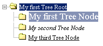
Now let me show you what you see when you run the FirstTree.aspx sample; note that under the
TreeView definition there is a single TreeNode element that will be the tree's
root that owns three child TreeNode
elements.
When you run this page you will see only the root element with a
plus sign that indicates that it is expandable. Click on it to see
how it expands or collapses. The following figure shows you the tree
expanded.

If you move your mouse over the nodes (My
first Tree Node, My second Tree
Node or My third Tree Node) you
see the following ToolTips:

This may be one of the simplest trees you can build, however it
is possible to easily enhance it with some useful attributes of this
powerful control.
Some Useful Attributes and Elements
The TreeView control has a really
rich object model; here you will see some useful attributes you will
use to render a tree structure in a cool way. Moreover you will use
some elements that will facilitate some common tasks.
Attributes: ImageUrl, ExpandedImageUrl,
SelectedImageUrl
When you create a TreeView it is
possible that you want to associate an image to reflect the status
of a node, for example, expanded or selected. First you have to put
some gif images in the same directory of your page then you can use
the ImageUrl, ExpandedImageUrl and SelectedImageUrl attributes of the TreeView element to associate an image to
the normal, expanded and selected status of a node respectively. <myfirsttree:treeview runat="server"
ImageUrl="closed.gif"
ExpandedImageUrl="closed.gif"
SelectedImageUrl="open.gif">
In the following figure you can see an example (the source code
of the samples in this section is stored in the FirstTreePlusAttrs.aspx).

Element: TreeNodeType; attributes: ChildType,
Type
Using the above attributes at TreeView level lets you define the
appearance of all the tree's nodes. You can define these attributes
also at TreeNode level, but you should
understand that this is not an efficient way to operate.
To build a TreeView with advanced appearance customization you
can use the TreeNodeType element to
group several attributes to associate to a collection of nodes. The
TreeNodeType element is used in
conjunction with the ChildType
attribute, so you can define the ChildType at TreeView level indicating that there is a
TreeNodeType element that defines
it.
The following code shows you how to define different TreeNodeType elements and how to associate
them with child nodes (see FirstTreePlusTypes.aspx). In the TreeView element I define the ChildType attribute that indicates that all
the child nodes will have attributes defined by a TreeNodeType element whose Type attribute is equal to "Folder ". ...
<myfirsttree:treeview runat="server" ChildType="Folder">
...
Here I define the attributes of the TreeNodeType element of type "Folder "; I define the ImageUrl, ExpandedImageUrl and SelectedImageUrl attributes and also a ChildType attribute indicating that all the
child nodes will have attributes defined by a TreeNodeType element whose Type attribute is equal to "Html ". ...
<mytree:treenodetype
Type="Folder"
ChildType="Html"
ImageUrl="closed.gif"
ExpandedImageUrl="closed.gif"
SelectedImageUrl="open.gif" />
...
Here I define the last TreeNodeType
element (of Type "Html ") and I define
only the ImageUrl attribute. ...
<mytree:treenodetype Type="Html" ImageUrl="html.gif" />
...
After the "type" definition there is the tree structure with
three nodes at the first level that own a single node each. ...
<myfirsttree:treenode text="My first Tree Node">
<myfirsttree:treenode text="My first Tree Leaf">
</myfirsttree:treenode>
</myfirsttree:treenode>
<myfirsttree:treenode text="My second Tree Node">
<myfirsttree:treenode text="My second Tree Leaf">
</myfirsttree:treenode>
</myfirsttree:treenode>
<myfirsttree:treenode text="My third Tree Node">
<myfirsttree:treenode text="My third Tree Leaf">
</myfirsttree:treenode>
</myfirsttree:treenode>
</myfirsttree:treeview>
...
As you can see the ChildType
attribute is used both in the TreeView
element and in the first TreeNodeType
element; the last TreeNodeType element
has no ChildType because this defines
the deepest type in the tree.
Attributes: DefaultStyle, HoverStyle,
SelectedStyle
For uplevel browsers (Internet Explorer/Netscape version 4 or
higher) you can further enhance the appearance of nodes using the
DefaultStyle, HoverStyle and SelectedStyle attributes:
- The DefaultStyle attribute sets
or retrieves a value that indicates the default style for the
element
- The HoverStyle attribute sets or
retrieves a value that indicates the style of the element when the
user hovers the keyboard focus or mouse pointer over it
- The SelectedStyle attribute sets
or retrieves a value that indicates the style for the selected
element
With each of these attributes you can define several Cascading
Style Sheets (CSS) attribute/value pairs.
The syntax for defining this pairs is the same you use to define
CSS in HTML pages, so you can use it to define fonts, colors,
dimensions, cursor, zoom, and so on.
The FirstTreePlusStyles.aspx sample
shows you the use of these attributes in a TreeNode element. The default style (so when
it is not selected nor when you point the mouse on it) of the TreeNode element labeled "My first Tree Node " shows the node with a
red background, a border of one pixel and black, Arial, 12pt
text. DefaultStyle="background:red;border:solid 1px;color:black;font-name:Arial;font-size:12pt"
The following figure shows how the node is displayed.

If you point your mouse on the node, it changes its color, the
text becomes white and the font size increases to 14pt. HoverStyle="color:white;font-size:14pt"
The following figure shows what happens if you pass your mouse on
it:
If you select the node, rather than just hovering over it, the
background changes to white and the text is displayed in red and is
bold: SelectedStyle="background:white;color:red;font-weight:bold"
As can be seen in this figure:

Attributes: SelectedNodeIndex, Expanded
As you have seen, when you first access a page, you can see only
the nodes at the first level that are collapsed. If you want your
tree be expanded with a particular node selected at first access,
you can use the following attributes.
The Expanded attribute of the TreeNode element is a Boolean attribute that
is "false " by default. If you set
this attribute to "true " you can see
the node expanded when you first access the page.
In the code belowyou can see some expanded nodes (see FirstTreeExpanded.aspx). First I expand the
root node: ...
<myfirsttree:treenode text="Italy" Expanded="true">
<myfirsttree:treenode text="North" Type="Folder"></myfirsttree:treenode>
Then I expand the second child node (text="Center"): <myfirsttree:treenode text="Center" Expanded="true" Type="Folder">
<myfirsttree:treenode text="Toscana"></myfirsttree:treenode>
<myfirsttree:treenode text="Emilia Romagna"></myfirsttree:treenode>
<myfirsttree:treenode text="Marche"></myfirsttree:treenode>
<myfirsttree:treenode text="Umbria"></myfirsttree:treenode>
<myfirsttree:treenode text="Lazio"></myfirsttree:treenode>
</myfirsttree:treenode>
...
Now I want the third node (text="Marche") to be selected at the first
access. To do so I have to use the SelectedNodeIndex attribute of the TreeView element. The value of this
attribute is the index of the TreeNode
to be selected. The index is built by concatenating the ordinal
number of the parent node at each level counting through the tree
from 0 down to the selected node and
delimiting each level with a dot (.).
The uppermost node in the top level of the tree is 0; the second node is 1, and so on. The node immediately following
the first top-level node is 0.0; the
second is 0.1, and so on.
So in the sample the index of the "Marche " node is "0.1.2 ". < myfirsttree:treeview runat="server"
SelectedNodeIndex="0.1.2"
ChildType="Folder"
SelectExpands="true">
The following figure shows what happens when you first access the
page.

Note: when you use the SelectedNodeIndex attribute you must expand
all the TreeNode elements so that the
node to be selected can be displayed. If you forget this, your page
will raise the following error:

You can test this error by deleting the Expanded attribute in the "Center " node. <myfirsttree:treenode text="Center" Type="Folder">
Attributes: SelectExpands
In the previous code sample you will have noted that the TreeView element contain the attribute SelectExpands. When this attribute is true, the node expands and collapses when
selected (and not just when you click on the "plus" or "minus"
sign); you can test this on the previous example.
Build a TreeView by Code
So far we have shown you how to build a "static" TreeView using the control's declarative
syntax. For some applications this approach can be enough, but for
several tasks you need to build a TreeView dynamically at run time.
In most cases the structure comes from a database so you will
have to deal with data binding. In this section you will learn how
to build a TreeView using code; the
third part of this article will describe the data bind support of
TreeView control.
A typical sample of a dynamic tree structure not coming from a
database is the filesystem structure. So suppose you have this
directory structure:
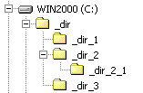
In the support files you will find three files that lets you to
build a Windows Explorer-like interface accessible via the web.
The TreeFrameset.htm file contains
the frame structure of this application and the TreeFileList.aspx contains the code to
display the contents of a selected directory (look at the comments
inside this file to learn how it works).
The code needed to build a programmatic tree is contained in the
TreeCode.aspx file; since you will
build the structure using code, you have to add only the TreeView element and a root TreeNode element to your page. The rest of
the structure is built by the code: <body>
<form id="Form1" method="post" runat="server">
<iewc:treeview id="TreeView1" runat="server"
ImageUrl="closed.gif"
ExpandedImageUrl="closed.gif"
SelectedImageUrl="open.gif"
SHOWTOOLTIP="false">
<iewc:TreeNode Text="_dir"
NavigateUrl="TreeFileList.aspx?path=C:\_dir"
Target="contents">
</iewc:TreeNode>
</iewc:treeview>
</form>
</body>
You need a DirectoryInfo class to
collect the folders set (see the DirectoryInfo class definition at http://msdn.microsoft.com/library/en-us/cpref/html/frlrfSystemIODirectoryInfoClassTopic.asp?WROXEMPTOKEN=2440221ZO0np8M1JqrR62zGgTp
for details).
To use a DirectoryInfo class you
need to import the namespace System.IO: <%@ Import namespace="System.IO" %>
Let me show how the code works now. First, look at the Page_Load method; this method is invoked as
the page is called. There I initialize a new instance of the DirectoryInfo class on the specified path,
it exposes instance methods for creating, moving, and enumerating
through directories and subdirectories of the "_dir " directory.
Then I define the Text attribute of
the root node; as you can see I use the ToolTip property I defined in the first
section of this article to show the number of directories and files
contained in the root directory.
Finally, I call a recursive procedure to add nodes to the
structure in the right position. I pass the just created object to
this procedure and the root TreeNode
element. To define an object that represents the root TreeNode element, I use the GetNodeFromIndex method of the TreeView object that returns the TreeNode object at the specified index, in
this case the object at the "0 " index
is exactly the root TreeNode
element. private void Page_Load(object sender, System.EventArgs e)
{
DirectoryInfo dir = new DirectoryInfo("C:\\_dir\\");
TreeView1.GetNodeFromIndex("0").Text = "<p OnMouseOver=popup
('Directories:_" + dir.GetDirectories().Length
+ "@brFiles:_" + dir.GetFiles().Length + "') OnMouseOut=kill()>_dir</p>";
analyzeCurrentDir(dir, TreeView1.GetNodeFromIndex("0"));
}
The analyzeCurrentDir procedure
receives in input the current directory you are exploring and the
TreeNode parent of the nodes you are going to add. public void analyzeCurrentDir(DirectoryInfo dirIn, TreeNode treenodeI)
{
Here I define an array of DirectoryInfo objects that will be filled by
the GetDirectories method of the DirectoryInfo object that returns the
subdirectories in the specified directory. So, the subdirs variable will contain all the
subdirectories in the "_dir "
directory at the first call, all the subdirectories of the "_dir_1 " directory at the first recursive
call, and so on. DirectoryInfo[] subdirs;
subdirs = dirIn.GetDirectories();
For each directory of this set you have to:
- Create a TreeNode object
- Define some attributes of this new node
- Attach the node to the structure; I use the Add method that adds a TreeNode to the end of the TreeView or TreeNode
- Run the recursive procedure on this new object.
Here is the code that does this: foreach (DirectoryInfo dir in subdirs)
{
//Create a TreeNode object
Microsoft.Web.UI.WebControls.TreeNode treenode = new TreeNode();
FileInfo[] files;
files = dir.GetFiles();
//Define the label of the node
treenode.Text = "<p OnMouseOver=popup('Directories:_" +
dir.GetDirectories().Length + "@brFiles:_" + files.Length + "')
OnMouseOut=kill()>" + dir.Name + "</p>";
//Define the URL of the page to navigate to when the user clicks a node
treenode.NavigateUrl = "TreeFileList.aspx?path=" + dir.FullName;
//Define a value that indicates the window or frame at which to
//target the contents
treenode.Target = "contents";
//Add the node at the end of the tree structure
treenodeI.Nodes.Add(treenode);
//Recursive call of the procedure
analyzeCurrentDir(dir, treenode); }
}
In the code above I introduced two new attributes that I will
explain in the next section.
Attributes: NavigateUrl, Target
After you have built a tree structure, you want of course use it
in some way. In the above sample you may want to list all the
directories and all the files contained in a directory simply
clicking on the relative node of the tree.
The NavigateUrl attribute of the
TreeNode object lets you define the
URL of the page to navigate to when the user click a node. The Target attribute lets you define a value
that indicates the window or frame at which to target the
contents.
Put It All Together
Well, now all that I have to do is to show you what happens when
you call the TreeFrameset.htm.

Conclusion
In this article, the first in a three part series, you have seen
how to work with the TreeView
WebControl. The first tree that you saw is a simple, but effective
program and you saw how to use the Text attribute of the TreeNode element in a "smart" way.
In the rest of the article you saw some useful attributes and
elements to work with, and at the end of this first part you saw how
to build a tree structure by code.
In the second and third parts of my article I will show some
other interesting features of the TreeView WebControl: handling events and
data binding. | 


 (14 raters)


